Add Box Plots to PowerPoint with Python
Share office file processing skills in .NET, Java, and C++.
In data analysis and statistical reporting, box and whisker charts (also known as box plots) are essential visualization tools. They clearly display data distribution characteristics, including the median, quartiles, and outliers, enabling viewers to quickly grasp the overall picture of a dataset. When creating presentations, embedding box and whisker charts directly into PowerPoint slides makes data analysis results more intuitive and professional.
This article demonstrates how to create and customize box and whisker charts in PowerPoint presentations using Python and the Spire.Presentation for Python library. With this approach, developers can automate the generation of presentations containing statistical analysis charts, improving work efficiency and ensuring consistency in data presentation.
Why Choose Box and Whisker Charts
Box and whisker charts are particularly useful in the following scenarios:
Comparing Multiple Datasets: Display the distribution of multiple data groups simultaneously for easy cross-comparison
Identifying Outliers: Automatically mark data points that fall outside the normal range
Showing Data Dispersion: Visually represent data variability through boxes and whiskers
Statistical Analysis Reporting: Provide professional-grade data visualization in business reports and academic presentations
Environment Setup
Before getting started, you need to install the Spire.Presentation for Python library. You can install it using pip:
pip install Spire.Presentation
Once installed, you can import and use this library in your Python scripts to manipulate PowerPoint documents.
Creating a Basic Box and Whisker Chart
The core steps for creating a box and whisker chart include: initializing the presentation, adding a chart, setting up the data source, configuring chart properties, and finally saving the file. Here's a complete example:
from spire.presentation.common import *
from spire.presentation import *

# Create a PowerPoint document
ppt = Presentation()

# Add a box and whisker chart to the first slide
# Parameters: chart type, position rectangle, whether to create from template
chart = ppt.Slides[0].Shapes.AppendChartInit(
    ChartType.BoxAndWhisker,
    RectangleF.FromLTRB(50, 50, 550, 450),
    False
)

# Set series labels
seriesLabel = ["Series 1", "Series 2", "Series 3"]
for i in range(len(seriesLabel)):
    chart.ChartData[0, i + 1].Text = seriesLabel[i]

# Set category labels
categories = [
    "Category 1", "Category 1", "Category 1", "Category 1",
    "Category 1", "Category 1", "Category 1",
    "Category 2", "Category 2", "Category 2", "Category 2",
    "Category 2", "Category 2",
    "Category 3", "Category 3", "Category 3", "Category 3",
    "Category 3"
]
for i in range(len(categories)):
    chart.ChartData[i + 1, 0].Text = categories[i]

# Set numeric data
values = [
    [-7, -3, -24], [-10, 1, 11], [-28, -6, 34],
    [47, 2, -21], [35, 17, 22], [-22, 15, 19],
    [17, -11, 25], [-30, 18, 25], [49, 22, 56],
    [37, 22, 15], [-55, 25, 31], [14, 18, 22],
    [18, -22, 36], [-45, 25, -17], [-33, 18, 22],
    [18, 2, -23], [-33, -22, 10], [10, 19, 22]
]

# Populate data into the chart
for i in range(len(seriesLabel)):
    for j in range(len(categories)):
        chart.ChartData[j + 1, i + 1].NumberValue = values[j][i]

# Bind data source to chart series
chart.Series.SeriesLabel = chart.ChartData[0, 1, 0, len(seriesLabel)]
chart.Categories.CategoryLabels = chart.ChartData[1, 0, len(categories), 0]

# Assign data values to each series
for i in range(len(seriesLabel)):
    chart.Series[i].Values = chart.ChartData[1, i + 1, len(categories), i + 1]

# Set chart title
chart.ChartTitle.TextProperties.Text = "Box and Whisker Chart Example"

# Display legend and set position
chart.HasLegend = True
chart.ChartLegend.Position = ChartLegendPositionType.Top

# Save the document
ppt.SaveToFile("BoxAndWhiskerChart.pptx", FileFormat.Pptx2013)
ppt.Dispose()
Result document:
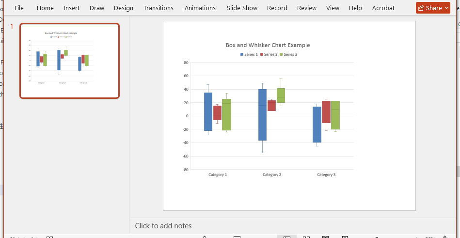
This code creates a box and whisker chart with three data series. The AppendChartInit method inserts a chart at a specified position on the slide, while RectangleF.FromLTRB defines the chart's position and size (left, top, right, bottom boundaries).
Customizing Box and Whisker Chart Styles
Box and whisker charts offer various customization options to adjust data display and visual effects. Here are several commonly used configuration options:
Displaying Outliers and Mean Markers
You can control whether to display inner points, outliers, mean markers, and mean lines by setting series properties:
# Configure the first series
chart.Series[0].ShowInnerPoints = False      # Do not display inner data points
chart.Series[0].ShowOutlierPoints = True     # Display outliers
chart.Series[0].ShowMeanMarkers = True       # Display mean markers
chart.Series[0].ShowMeanLine = True          # Display mean line

# Set quartile calculation method
chart.Series[0].QuartileCalculationType = QuartileCalculation.ExclusiveMedian
The meanings of these properties are as follows:
ShowInnerPoints: Controls whether to display data points within the boxShowOutlierPoints: Controls whether to display outliers (points outside the whisker range)ShowMeanMarkers: Controls whether to display mean marker pointsShowMeanLine: Controls whether to display the mean lineQuartileCalculationType: Sets the quartile calculation method, with optionsExclusiveMedian(excluding the median) orInclusiveMedian(including the median)
Applying Different Configurations to Different Series
You can set different display options for each data series to meet different analysis requirements:
# First series: Use exclusive median method
chart.Series[0].ShowInnerPoints = False
chart.Series[0].ShowOutlierPoints = True
chart.Series[0].ShowMeanMarkers = True
chart.Series[0].ShowMeanLine = True
chart.Series[0].QuartileCalculationType = QuartileCalculation.ExclusiveMedian

# Second series: Use inclusive median method
chart.Series[1].ShowInnerPoints = False
chart.Series[1].ShowOutlierPoints = True
chart.Series[1].ShowMeanMarkers = True
chart.Series[1].ShowMeanLine = True
chart.Series[1].QuartileCalculationType = QuartileCalculation.InclusiveMedian

# Third series: Use exclusive median method
chart.Series[2].ShowInnerPoints = False
chart.Series[2].ShowOutlierPoints = True
chart.Series[2].ShowMeanMarkers = True
chart.Series[2].ShowMeanLine = True
chart.Series[2].QuartileCalculationType = QuartileCalculation.ExclusiveMedian
This flexibility allows you to compare results from different statistical methods within the same chart.
Complete Example
Combining all the features mentioned above, here is a complete example for creating a box and whisker chart:
from spire.presentation.common import *
from spire.presentation import *

outputFile = "CreateBoxAndWhiskerChart.pptx"

# Create a PowerPoint document
ppt = Presentation()

# Add a box and whisker chart to the first slide
chart = ppt.Slides[0].Shapes.AppendChartInit(
    ChartType.BoxAndWhisker,
    RectangleF.FromLTRB(50, 50, 550, 450),
    False
)

# Set series labels
seriesLabel = ["Series 1", "Series 2", "Series 3"]
for i in range(len(seriesLabel)):
    chart.ChartData[0, i + 1].Text = seriesLabel[i]

# Set category labels
categories = [
    "Category 1", "Category 1", "Category 1", "Category 1",
    "Category 1", "Category 1", "Category 1",
    "Category 2", "Category 2", "Category 2", "Category 2",
    "Category 2", "Category 2",
    "Category 3", "Category 3", "Category 3", "Category 3",
    "Category 3"
]
for i in range(len(categories)):
    chart.ChartData[i + 1, 0].Text = categories[i]

# Set numeric data
values = [
    [-7, -3, -24], [-10, 1, 11], [-28, -6, 34],
    [47, 2, -21], [35, 17, 22], [-22, 15, 19],
    [17, -11, 25], [-30, 18, 25], [49, 22, 56],
    [37, 22, 15], [-55, 25, 31], [14, 18, 22],
    [18, -22, 36], [-45, 25, -17], [-33, 18, 22],
    [18, 2, -23], [-33, -22, 10], [10, 19, 22]
]

# Populate data into the chart
for i in range(len(seriesLabel)):
    for j in range(len(categories)):
        chart.ChartData[j + 1, i + 1].NumberValue = values[j][i]

# Bind data source
chart.Series.SeriesLabel = chart.ChartData[0, 1, 0, len(seriesLabel)]
chart.Categories.CategoryLabels = chart.ChartData[1, 0, len(categories), 0]

# Assign data values to each series and set display options
for i in range(len(seriesLabel)):
    chart.Series[i].Values = chart.ChartData[1, i + 1, len(categories), i + 1]
    chart.Series[i].ShowInnerPoints = False
    chart.Series[i].ShowOutlierPoints = True
    chart.Series[i].ShowMeanMarkers = True
    chart.Series[i].ShowMeanLine = True

    # Set different quartile calculation methods based on series index
    if i == 1:
        chart.Series[i].QuartileCalculationType = QuartileCalculation.InclusiveMedian
    else:
        chart.Series[i].QuartileCalculationType = QuartileCalculation.ExclusiveMedian

# Display legend
chart.HasLegend = True
chart.ChartLegend.Position = ChartLegendPositionType.Top

# Set chart title
chart.ChartTitle.TextProperties.Text = "BoxAndWhisker"

# Save the document
ppt.SaveToFile(outputFile, FileFormat.Pptx2013)
ppt.Dispose()
Result document:
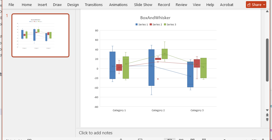
After running this code, a PowerPoint file named CreateBoxAndWhiskerChart.pptx will be generated, containing a formatted box and whisker chart.
Practical Application Recommendations
In real-world work scenarios, you can apply box and whisker charts to the following situations:
Quality Control Reports: Display the distribution of product dimensions, weights, and other metrics to identify non-conforming items
Financial Analysis: Compare the distribution of revenue and expenses across different quarters or departments
Academic Research: Present statistical characteristics and outliers of experimental data
Performance Monitoring: Visualize the fluctuation range of system response times, throughput, and other metrics
By automating the generation of these charts, you can reduce manual operations, ensure timely data updates, and maintain a professional appearance in your presentations.
Summary
This article demonstrated how to create box and whisker charts in PowerPoint using Python and the Spire.Presentation library. We learned how to set up chart data, configure display options, customize quartile calculation methods, and combine these features into a complete solution.
Box and whisker charts are powerful tools in statistical analysis, capable of intuitively displaying data distribution characteristics. By programmatically generating these charts, you can not only improve work efficiency but also ensure consistency and accuracy in data presentation. Developers can further explore other chart types and customization options based on specific needs to create richer data visualization presentations.


